

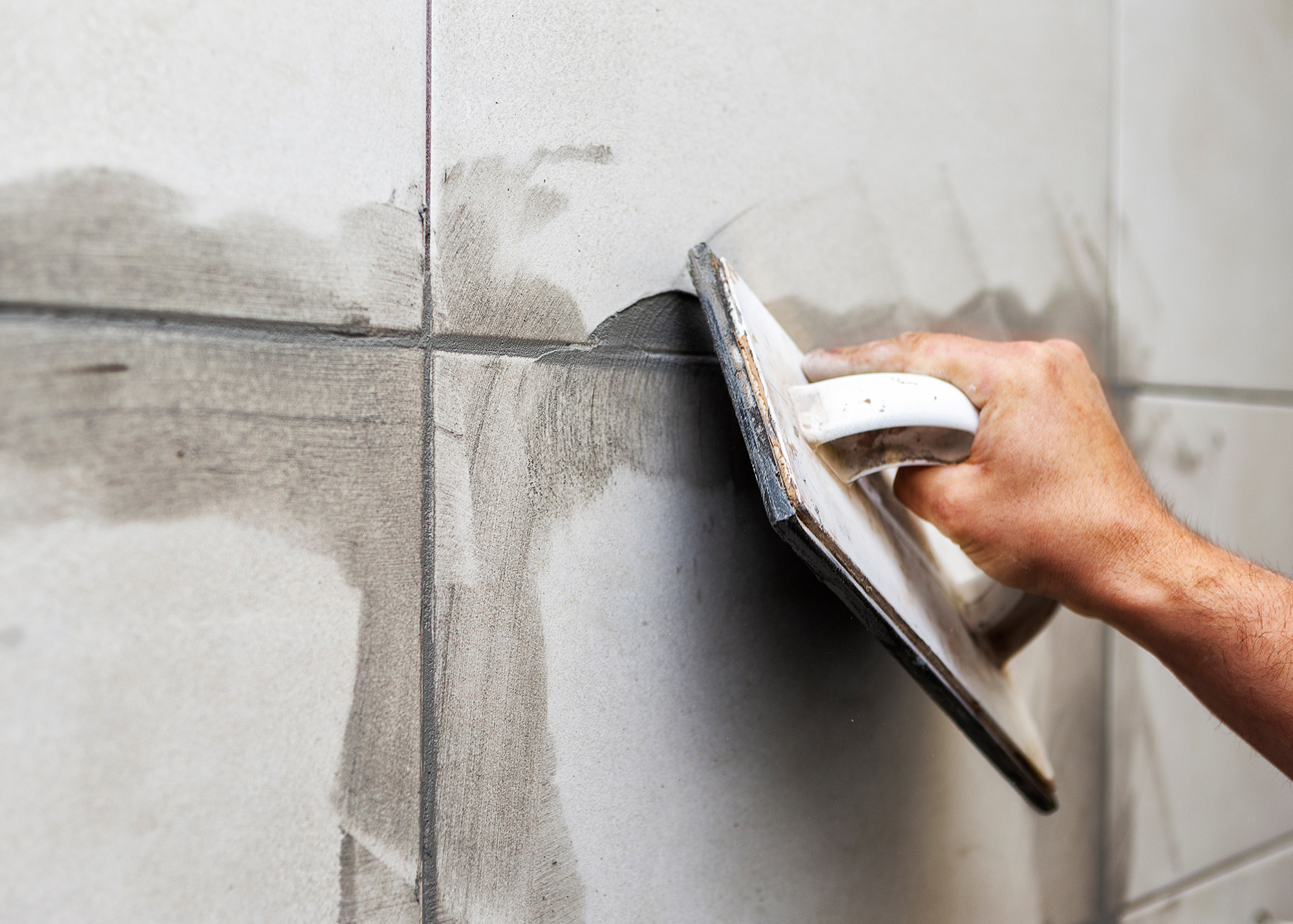
Glass tile can catch light, reflect color, and make a wall or floor feel more open, but the grout around each piece still plays a major visual role. If you are comparing tile flooring options or planning a glass tile backsplash, do not treat grout as an afterthought. Tile grout lines can either fade into the background or become part of the pattern.
Why Grout Color Stands Out With Glass Tile
Glass has a different visual quality from ceramic or porcelain. Light travels through or reflects from its surface, so the color behind and between pieces can affect what you see. That makes tile grout color especially important when the glass is translucent, lightly colored, iridescent, or made from small mosaic pieces.
A matching grout usually creates a calmer, more continuous appearance. A contrasting grout makes individual pieces easier to see, which can emphasize a geometric layout. Neither approach is automatically better. The right choice depends on whether you want the glass itself to be the star or want the installation pattern to have equal visual weight.
Matching Grout for a Softer Look
Grout that closely matches the dominant color of the glass tends to reduce the appearance of individual tile grout lines. This can make a mosaic look more unified and can keep a small space from feeling overly busy.
For example, pale blue glass with a soft blue or neutral grout can create a watery, seamless effect. Cream, white, or light gray glass can work similarly with a nearby neutral grout. This approach is particularly useful when the tile already has movement, variation, shimmer, or several related shades.
Matching does not have to mean choosing an identical color. A slightly deeper or lighter grout can provide enough definition to preserve the pattern without outlining every piece.
Contrasting Grout Changes the Pattern
A stronger grout contrast can make the shape and layout of glass tile much more noticeable. Dark grout around light tile can turn a simple mosaic into a crisp graphic pattern, while a lighter grout around darker glass can create a softer version of the same effect.
Contrast can be useful when the tile has a straightforward shape, such as squares, rectangles, or a repeating hexagon. It can also help a distinctive installation pattern read clearly from across the room. The trade-off is visual busyness. If the glass has multiple colors, strong texture, or a complicated mosaic arrangement, high-contrast grout may compete with the tile rather than complement it.
Think About the Tile Size and Room
The smaller the glass tile, the more grout you may see. A sheet of tiny mosaic pieces can contain a surprising amount of grout, so its color has a substantial effect on the overall appearance. Larger tiles usually create fewer grout lines, making the grout color less dominant. Room size matters, too. In a compact bathroom or shower, a low-contrast grout can help the surface feel calmer. In an open kitchen or larger bath, stronger definition can be easier to appreciate without making the space feel crowded.
Think about the viewing distance as well, because grout that looks bold up close may read as a subtle texture from several feet away. Also consider surrounding materials. A backsplash seen next to a busy countertop may need quieter grout, while a simple countertop can leave more room for a patterned tile installation. Cabinet colors, countertops, paint, fixtures, and flooring can make a seemingly neutral grout look warmer or cooler. Always evaluate a sample in the actual room's lighting before committing.
Choose for Appearance and Maintenance
Color is not the only grout decision. The joint size, grout type, tile finish, and installation quality all affect the finished result. Darker grout can make stains or mineral deposits less noticeable in some settings, while very light grout may show dirt more readily. However, maintenance depends on the location and the specific grout product, so color alone should not determine your selection.
It is also smart to view a larger sample. A tiny sample board may make a color look subtle, while dozens of repeating tile grout lines can make the same shade much more noticeable. If possible, place the sample next to the countertop, cabinet, paint, and other finishes you plan to keep.
Make the Grout Part of the Design
The best tile grout color is the one that supports the look you want instead of fighting it. Match it closely when you want glass tile to read as a smooth field, or choose measured contrast when you want the pattern to stand out. For an installation with several competing finishes, a middle-ground neutral can provide definition without adding another strong color.
If you are narrowing down tile flooring, glass tile, or other surfaces, Act 1 Flooring can help you evaluate samples and design possibilities. Contact the team to discuss your project, and visit Pensacola, FL to see flooring and tile options in person. You can also explore choices that work across Pensacola, Milton, Pace, Gulf Breeze, and Navarre, FL before making the final selection.


